
Website Design
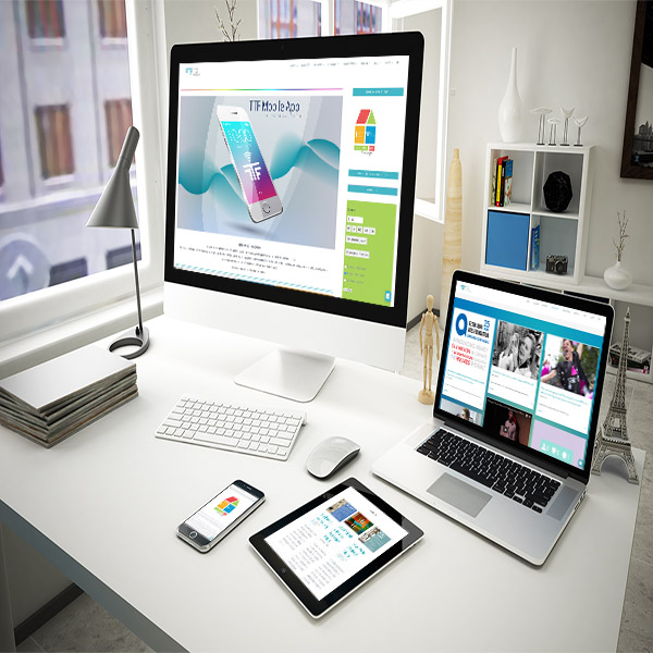
RESPONSIVE DESIGN: LOOKING SHARP ON EVERY SCREEN
Things are looking great on your screen… but are you sure that your visitors are having the same experience? From tablets and mobiles to widescreen displays, sites can often get jumbled and chopped beyond recognition and usability. A responsive design allows your website to adapt itself to any window size, which means you make the best impression on every device and every screen.
Responsive design is also great for planning ahead, as it will continue to adapt itself to new screen sizes as they’re introduced.
Your presence on the web deserves to be custom-built. We design your site around your content and your brand, putting your most important offers in the spotlight and crafting a unique identity that will set you apart from the crowd. With self-manageable options, you can easily update your site with a few keystrokes – no programming knowledge, no sweat! Full control over your content gives you the ability to stay current and keep things fresh. Offering your clients the most recent news and the latest product info will keep them coming back for more!
On the flip side, if you don’t have time to make updates, we can certainly lend a hand with that, too! From web maintenance to blog updates, we’re partners through and through.