Written by Karla Cook
What Are Current Website Trends?
- Bold Typography
- Cinemagraphs
- Brutalism
- Saturated Gradients
- Vivid Layers of Color
- Text-Only
- Illustration
- Ultra-Minimalism
- Duotone
- Mixing Horizontal and Vertical Text
- Geometric Shapes and Patterns
- Serif Fonts
- Overlapping Text and Images
- Organic Shapes
- Hand-Drawn Fonts
The landscape of web design is constantly evolving.
Something that looked modern and fresh yesterday can appear dated seemingly overnight, and trends once dismissed as irrevocably passé can unexpectedly cycle back in vogue.
To help you prepare for wherever the web design tide takes us in 2018, we’ve put together a list of 15 trends to keep a close eye on. Check them out below, and get inspired to tackle your web design projects this year with style.
Download our full collection of website homepage examples here to inspire your own homepage design.
15 Web Design Trends to Watch in 2018
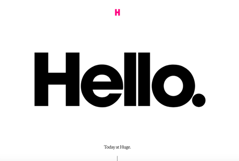
1. Bold Typography
More and more companies are turning to big, bold typography to anchor their homepages. This style works best when the rest of the page is kept minimal and clean, like this example from Brooklyn-based agency Huge.
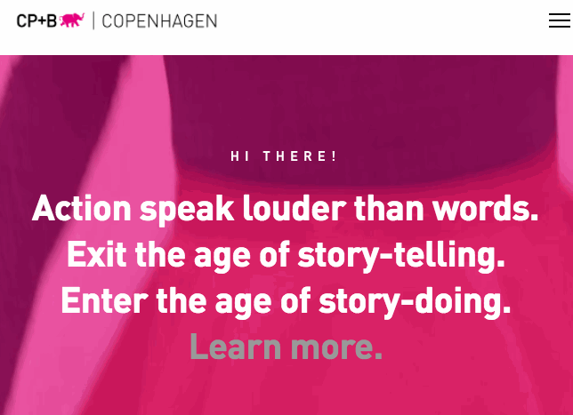
2. Cinemagraphs
Cinemagraphs — high-quality videos or GIFs that run on a smooth, continuous loop — have become a popular way to add movement and visual interest to otherwise static pages. Full-screen loops, like this example from Danish agency CP+B Copenhagen, create immediate interest on an otherwise simple page.
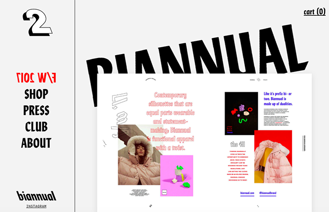
3. Brutalism
To stand out in a sea of tidy, organized websites, some designers are opting for more eclectic, convention-defying structures. While it can seem jarring at first, many popular brands are now incorporating these aggressively alternative design elements into their sites, such as Bloomberg.
Brutalism emerged as a reaction to the increasing standardization of web design, and is often characterized by stark, asymmetrical, nonconformist visuals, and a distinct lack of hierarchy and order. In other words, it’s hard to describe, but you know it when you see it — like the below example from apparel designer Biannual.
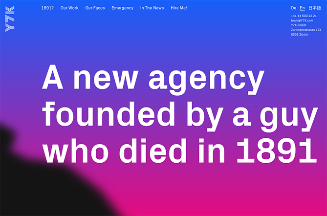
4. Saturated Gradients
Kaleidoscopic gradients were everywhere in 2017, and they aren’t going anywhere in 2018. Zurich-based agency Y7K illustrates a perfect example of how to make this two-tone effect look fresh and modern, with their full-screen, gradient-washed homepage.
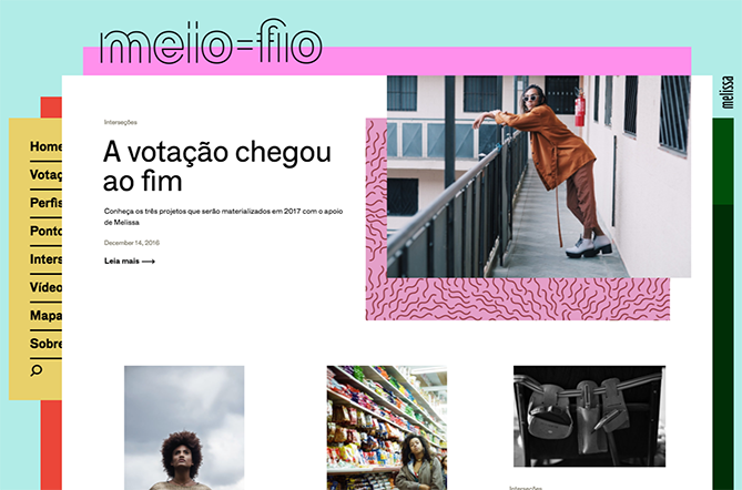
5. Vivid Layers of Color
Staggered, stacked layers of color add depth and texture to a simple site layout, as seen in this stylish example from the São Paulo-based team behind Melissa Meio-Fio.
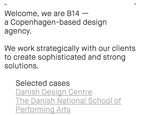
6. Text-Only
Some websites are cutting out images and prominent navigation sections altogether, relying on a few choice lines of straightforward text to inform visitors about their company.
Danish agency B14 uses their homepage real estate to simply describe their mission statement and provide links to samples of their work. It’s a modern, uncluttered approach to presenting information.
7. Illustration
More companies are turning to illustrators and graphic artists to create bespoke illustrations for their websites. After years dominated by flat design and straightforward minimalism, adding illustrated touches to your site is a great way to inject a little personality, as seen in this charming example from NewActon (designed by Australian digital agency ED).

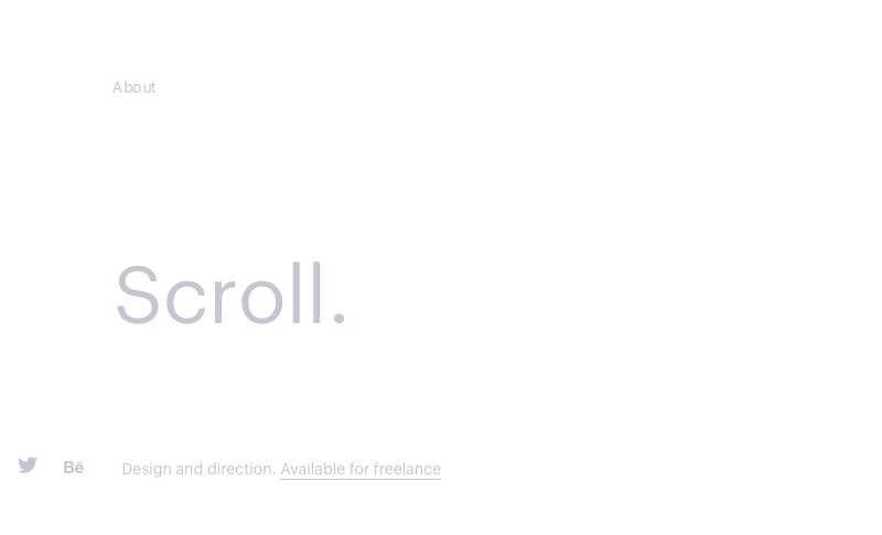
8. Ultra-minimalism
Taking classic minimalism to the extreme, some designers are defying conventions of what a website needs to look like, displaying just the absolute bare necessities. The site from designer Mathieu Boulet is centered around a few choice links to his social profiles and information.
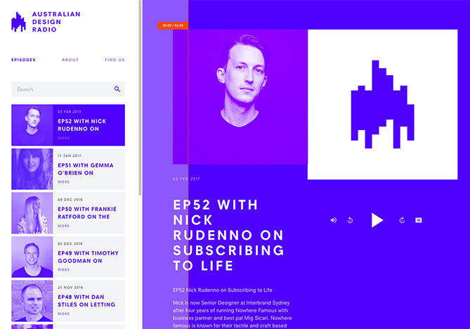
9. Duotone
These parred-down, two-tone color schemes look cool and contemporary, like this example from Australian Design Radio.
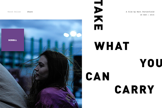
10. Mixing Horizontal and Vertical Text
Freeing text from its usual horizontal alignment and placing it vertically on a page adds some refreshing dimension. Take this example from director Matt Porterfield, which mixes horizontal and vertical text alignments on an otherwise very simple page.
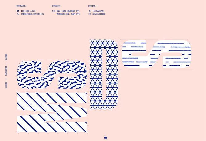
11. Geometric Shapes and Patterns
Whimsical patterns and shapes are popping up more frequently on websites, adding some flair in a landscape otherwise ruled by flat and material design. Canadian design studio MSDS uses daring, patterned letters on their homepage.
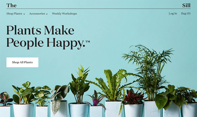
12. Serif Fonts
Due to screen resolution limitations and an overall lack of online font support, designers avoided serif fonts for years to keep websites legible and clean. With recent improvements, serif fonts are having a big moment in 2018 — and they’ve never looked more modern. As seen on The Sill, a serif headline adds a dose of sophistication and style.
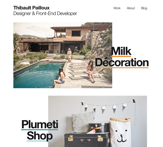
13. Overlapping Text and Images
Text that slightly overlaps accompanying images has become a popular effect for blogs and portfolios. Freelance art director and front-end developer Thibault Pailloux makes his overlapping text stand out with a colorful underline beneath each title.
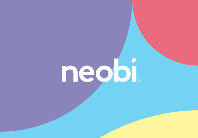
14. Organic Shapes
Gone are the days of strict grid layouts and sharp edges — 2018 will be all about curved lines and soft, organic shapes. In the example below from Neobi, the borderline-cartoonish background adds a generous hit of personality and vivid color to the uncomplicated design.
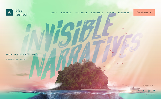
15. Hand-Drawn Fonts
Custom, hand-drawn fonts have started cropping up more and more in recent months — and for good reason. These unique typefaces add character and charm, and help designers create a distinct look and feel without a complete overhaul. On KIKK Festival’s website, a hand-drawn font provides a whimsical anchor for the homepage.
What web design trends do you think will really take off in 2018?